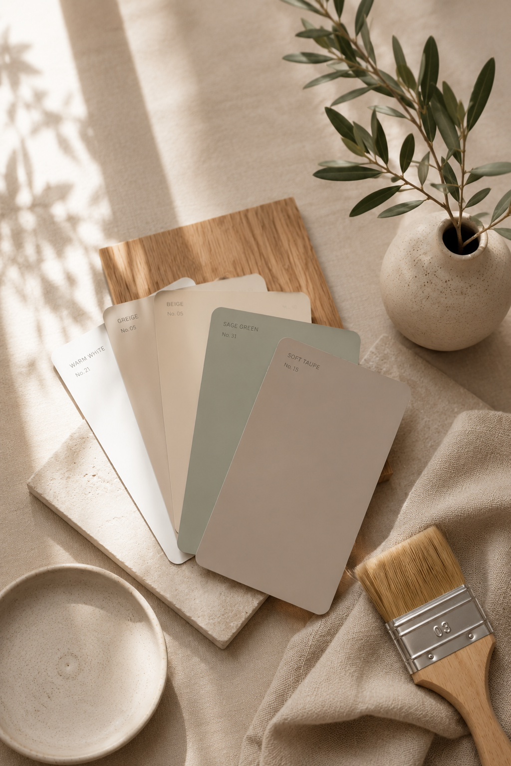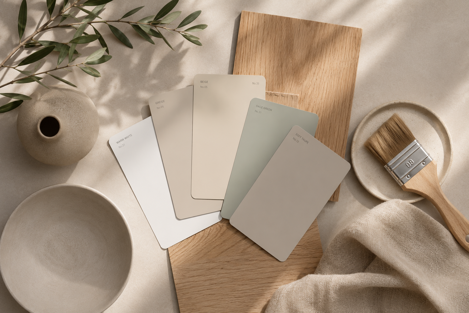
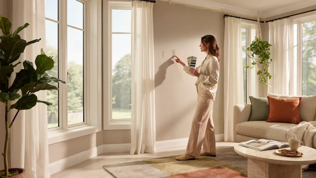
I stood in my sunroom holding five paint chips and still had no idea what to pick. Sound familiar?
Choosing the wrong color is easier than you think, especially when you do not know how sunlight changes everything.
A shade that looks perfect in the store can look completely off once the light hits it. In this post, I cover the top selling sunroom paint colors that actually work in real homes.
I walk you through what makes a color perform well, which 13 shades are worth trying, the right finish to use, and what mistakes to avoid.
I have tested this firsthand, so you are getting real advice.
By the end, you will know exactly where to start.
What Makes a Sunroom Paint Color Work So Well?
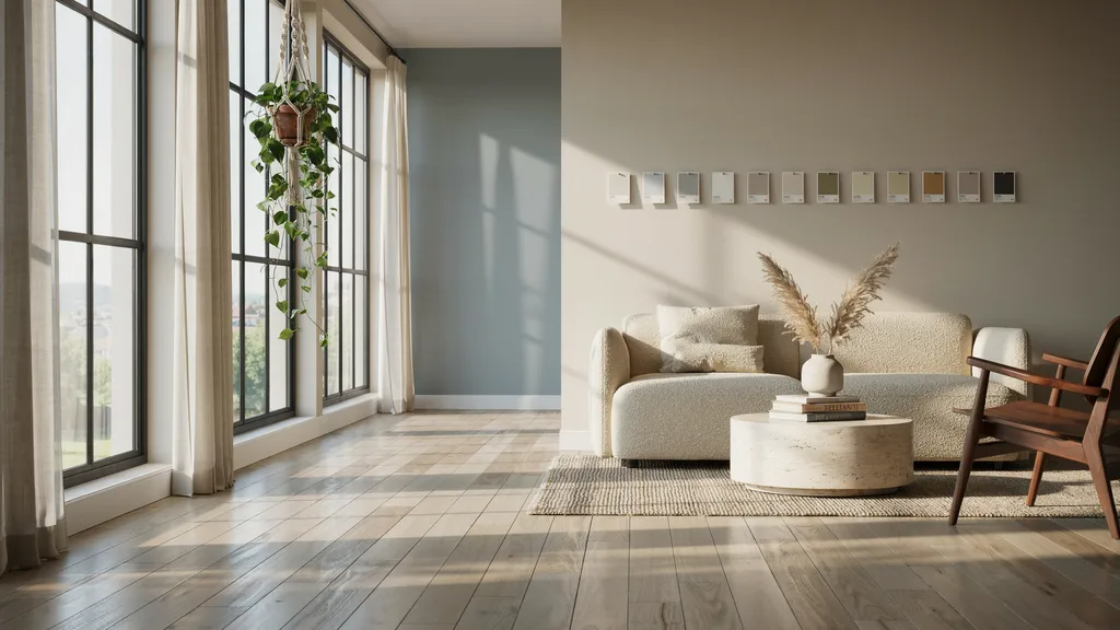
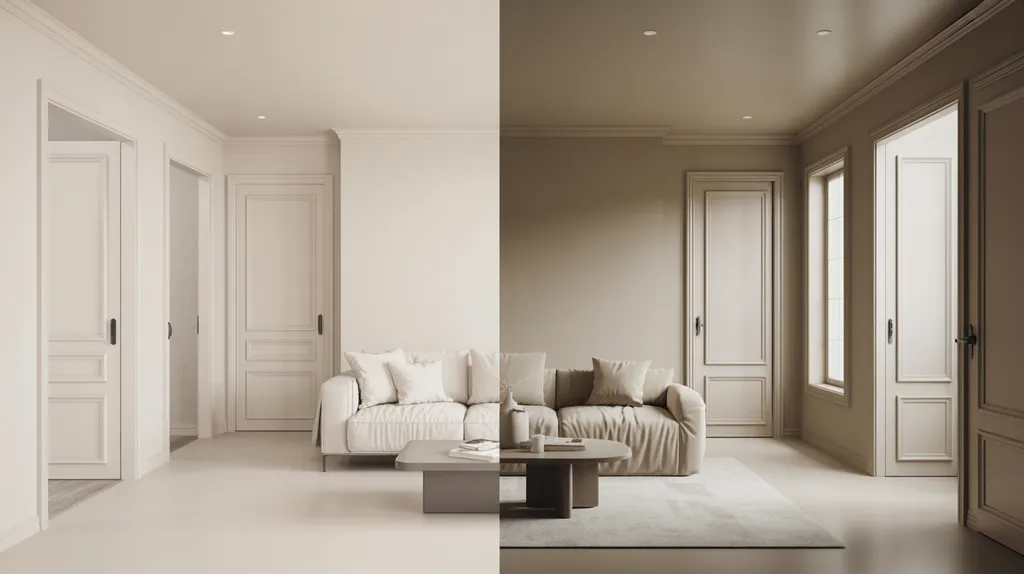
Not every color behaves the same once sunlight gets involved. A shade that looks muted indoors can appear washed out in a bright sunroom.
Natural light also shifts throughout the day. Morning light runs cooler and bluer, while afternoon light turns warmer and more golden.
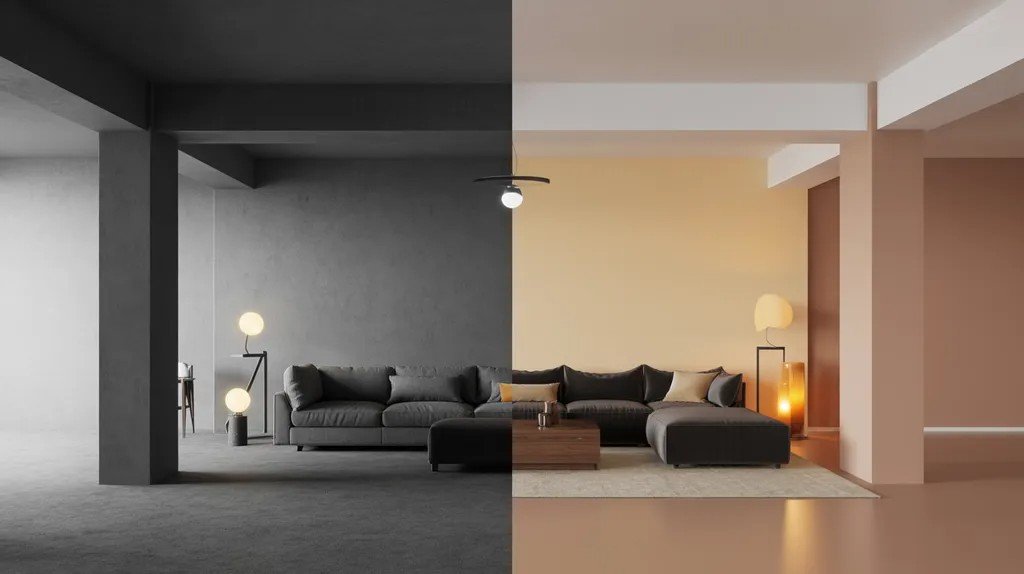
This is why lighter shades stay at the top of best-seller lists year after year. Color also affects how big or small a room feels.
Before you pick a shade, think about your sunroom's direction, your existing furniture and flooring, your preferred warm or cool feel, and how much upkeep you are willing to do.
Top 13 Selling Sunroom Paint Colors
Here are the most popular choices homeowners keep coming back to.
1. Crisp White
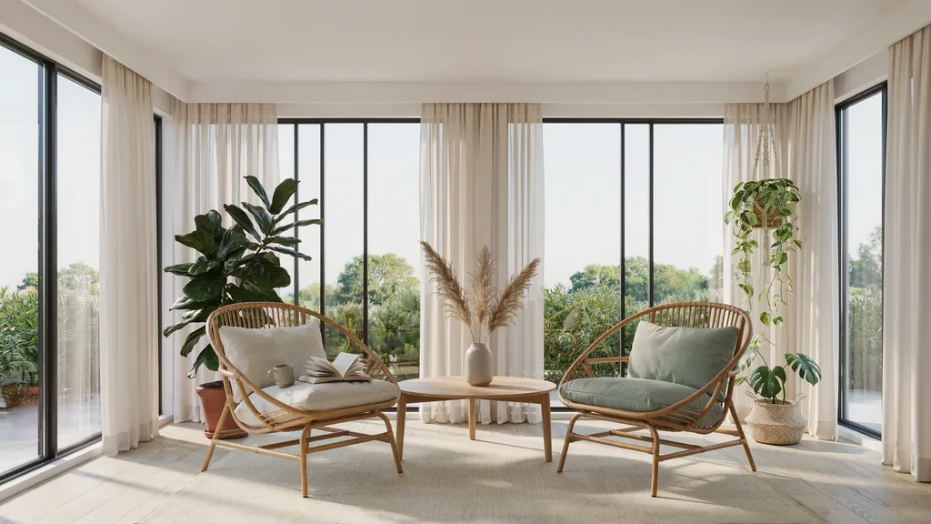
Crisp white is the most popular sunroom color for good reason. It reflects natural light better than almost any other shade.
Your sunroom will feel bright and open from the moment the sun comes up. It pairs well with wood floors, rattan furniture, and bold accent pieces.
The only downside is that it shows dirt faster. Wipe down the walls every few weeks to keep it looking fresh. For most sunrooms, crisp white is a solid, low-risk pick.
2. Warm White
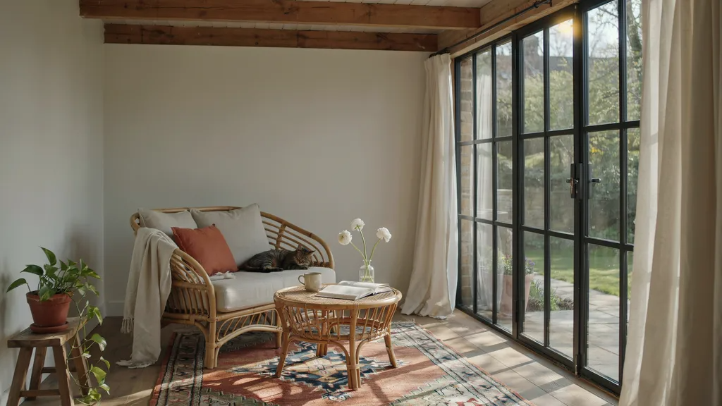
Warm white sits between pure white and cream. It softens the harshness that sometimes comes with a bright white finish.
If crisp white ever felt too cold or clinical in your home, warm white is the fix. It still reflects plenty of light but adds a gentle, lived-in feel.
It works especially well in sunrooms with natural wood beams, wicker chairs, or linen cushions. Warm white ages well too, meaning it still looks good after years of sun exposure.
3. Creamy Off-White
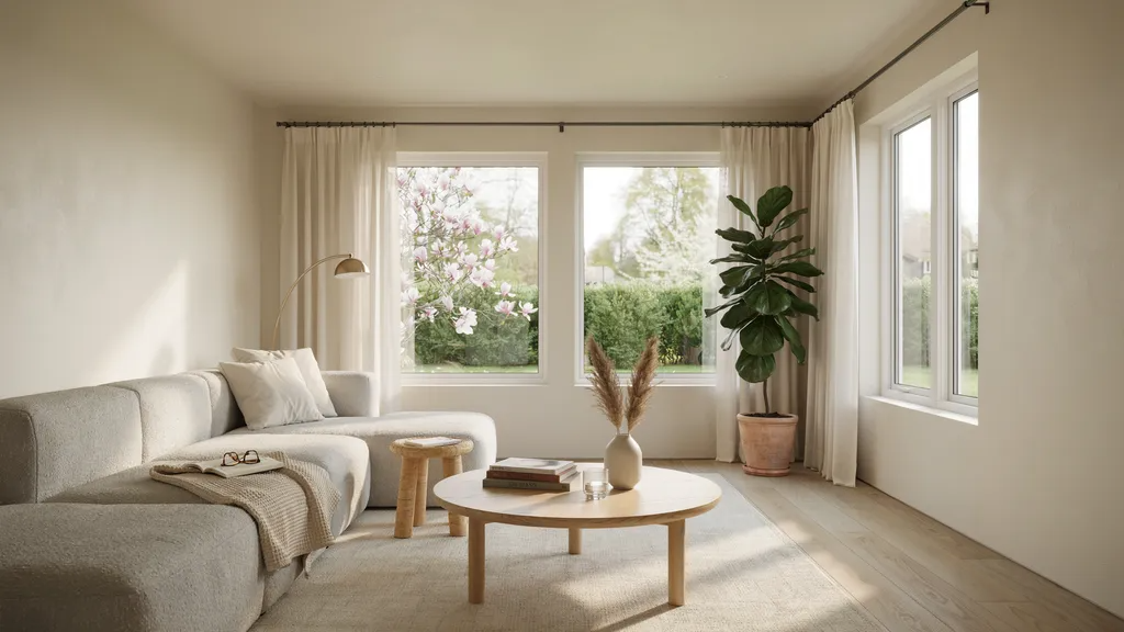
Creamy off-white has a cozy quality that most whites lack. It feels welcoming without being loud. This shade fits both older, traditional sunrooms and newer, more modern ones.
If you want your sunroom to feel like a relaxed retreat rather than a showroom, creamy off-white delivers.
It pairs well with soft grays, natural wood tones, and muted greens. The warmth in this shade helps it hold up well against changing light throughout the day.
4. Pale Blue
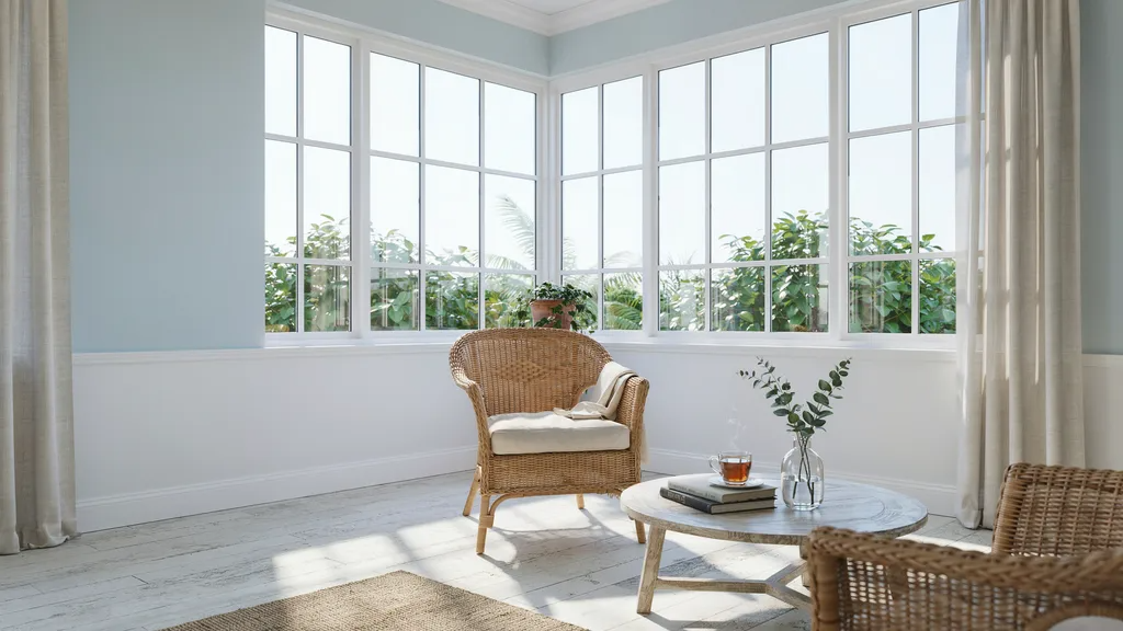
Pale blue brings a calm, airy quality to any sunroom. It mimics the look of a clear sky, which makes the space feel connected to the outdoors.
This shade works especially well in coastal-style sunrooms or homes near water. It pairs nicely with white trim, sandy tones, and natural fiber rugs.
Pale blue stays cool in rooms that get a lot of afternoon sun. If you want a sunroom that feels relaxed and easy to be in, pale blue is worth testing.
5. Soft Sage Green
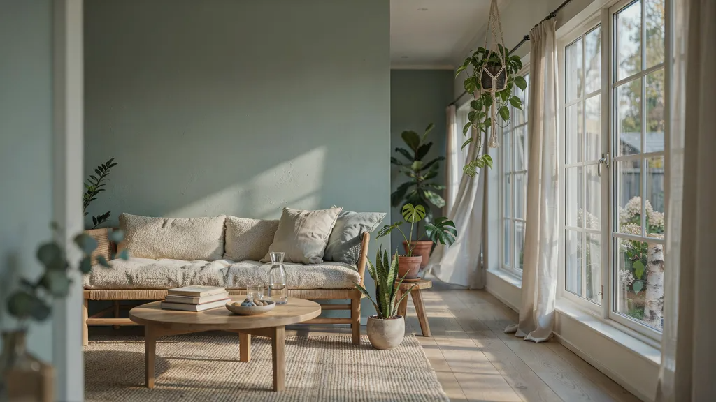
Soft sage green brings a quiet, natural energy into the room. It feels like the outdoors came inside, without going overboard.
This shade works well with plants, wooden furniture, and earthy textures. It is also forgiving in changing light. In the morning it can read as a muted gray-green.
By afternoon it picks up more warmth. If you have a lot of green plants in your sunroom, soft sage green walls will make them stand out in the best way.
6. Seafoam Green
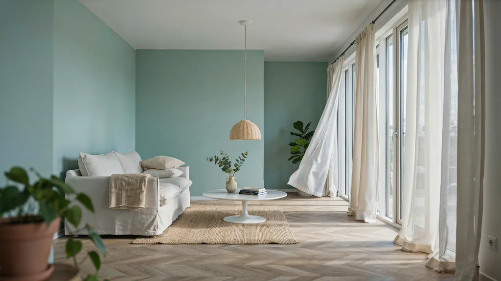
Seafoam green is fresher and lighter than sage. It has a subtle brightness that lifts the mood of a room without feeling too bold.
It works well in sunrooms that face east or north, where light is softer. Pair it with white furniture and natural wood accents for a clean, breezy look.
Seafoam green reflects light well and keeps the space feeling open. It is one of those shades that looks good in photos and even better in person.
7. Light Gray
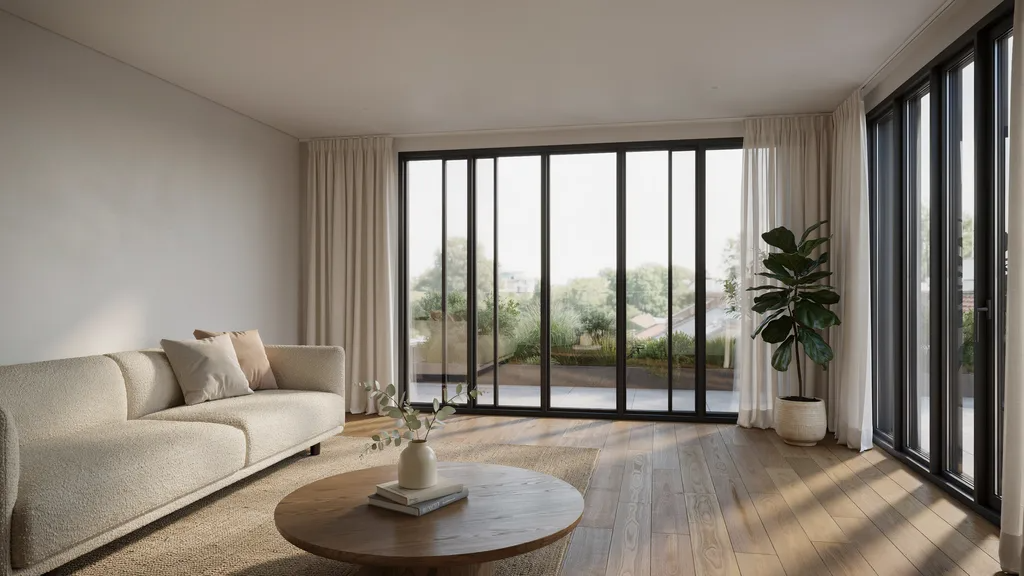
Light gray is a strong, versatile pick for modern sunrooms. It does not compete with your furniture or decor.
Instead, it acts as a clean backdrop that lets everything else shine. It pairs well with white trim, black accents, and warm wood tones.
Light gray also holds up well in rooms that get a lot of direct sunlight. It does not fade or yellow the way some whites do.
8. Greige
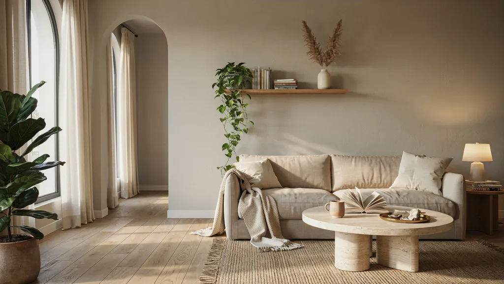
Greige is half gray and half beige. It sounds like a compromise, but it actually works better than either color alone in many sunrooms.
It is warm enough to feel cozy but cool enough to feel current. Greige pairs well with almost any style, from farmhouse to mid-century modern to classic traditional.
It is also very forgiving in changing light. If you are unsure between warm and cool tones, greige is often the answer. It is one of the safest and most popular choices on this list.
9. Warm Beige
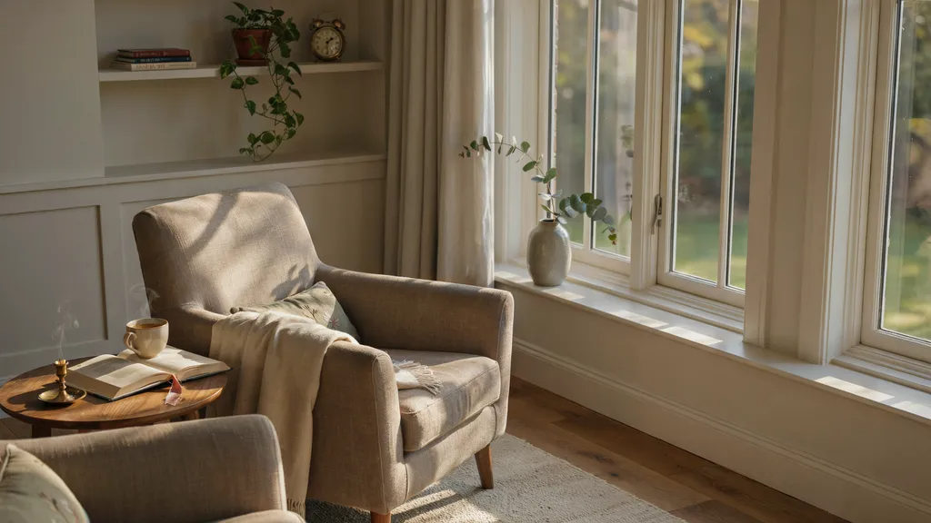
Warm beige creates a welcoming feeling that is hard to beat. It pairs well with cream, brown, and soft orange tones.
In a sunroom, it picks up the warmth of afternoon light and feels almost golden. It is a great pick if your sunroom gets a lot of direct sun. The warmth it adds does not overwhelm the space.
Instead, it makes the room feel comfortable and easy to spend time in. Warm beige works best in sunrooms used for relaxing, reading, or having a cup of coffee in the morning.
10. Soft Taupe
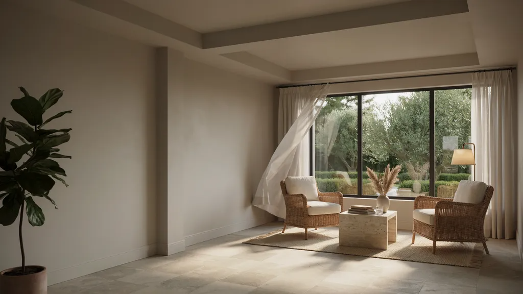
Soft taupe adds a sense of depth that flat neutrals often lack. It is darker than beige but still light enough to keep the room feeling open.
This shade looks great with wood furniture, wicker chairs, and natural stone accents. Soft taupe does not read as bold or daring, but it adds a quiet richness to the walls.
In the right sunroom, it can feel warm and grounded at the same time. It is a good pick if you want a neutral that does a little more than just blend in.
11. Buttercream Yellow
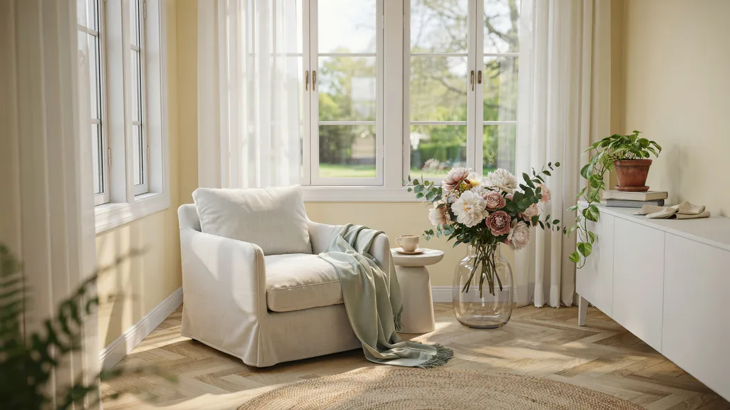
Buttercream yellow is cheerful without being loud. It adds a sun-filled quality to sunrooms that do not get as much natural light.
If your sunroom faces north and feels a bit dim, buttercream yellow can fix that. It pairs well with white furniture, soft greens, and light wood tones. This shade feels happy and easy to be in.
Keep the saturation low though. A yellow that is too bright will feel overwhelming fast. The soft, creamy versions of yellow are the ones that hold up best over time.
12. Blush Pink
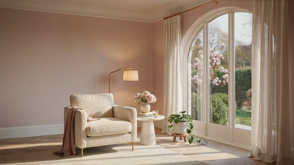
Blush pink is softer and more versatile than most people expect. It adds warmth and personality without taking over the room.
In a sunroom with good light, blush pink walls can feel almost peachy and glowing. It pairs well with white, cream, and muted gold accents.
This shade works especially well in sunrooms used as a reading nook, home office, or sitting room.
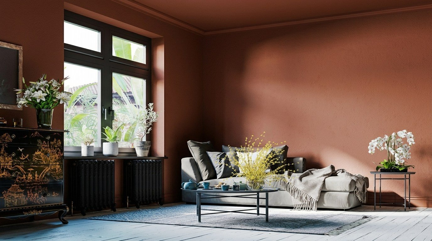
13. Light Terracotta
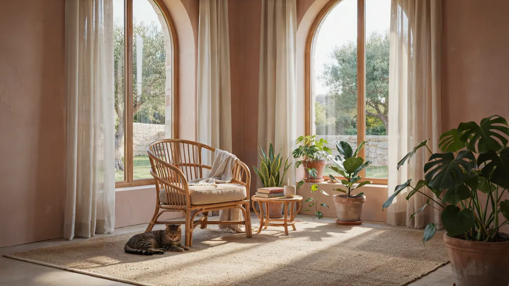
Light terracotta brings an earthy, grounded quality to a sunroom. It feels warm and relaxed without being too intense.
This shade works well with natural materials like rattan, jute, and reclaimed wood. It also pairs beautifully with plants and clay pots.
Light terracotta does absorb more light than pale shades, so test it first in a sunroom with good brightness. In the right space, it adds a richness that soft neutrals simply cannot match.
Choosing the Right Paint Finish for a Sunroom
The finish matters just as much as the color. A matte finish hides wall imperfections well, but it scuffs easily and is harder to wipe clean.
This makes it a poor choice for high-traffic sunrooms. An eggshell finish offers a soft, low-sheen look that is much easier to clean than matte.
It holds up better against moisture and light scuffs. A satin finish is the most durable of the three and reflects the most light.
It is the best pick for sunrooms that get heavy use, especially if you have kids or pets. For most sunrooms, eggshell or satin is the smart choice.
Common Mistakes to Avoid When Picking Sunroom Paint Colors
A few simple errors can send you back to the paint store. Watch out for these.
- Choosing colors only from online photos. Screens distort color. What looks pale blue online can look lavender in real life.
- Ignoring your existing furniture and flooring. Your paint needs to work with what is already in the room.
- Using dark shades on all four walls. One dark wall can look great. Four can make a sunroom feel like a cave.
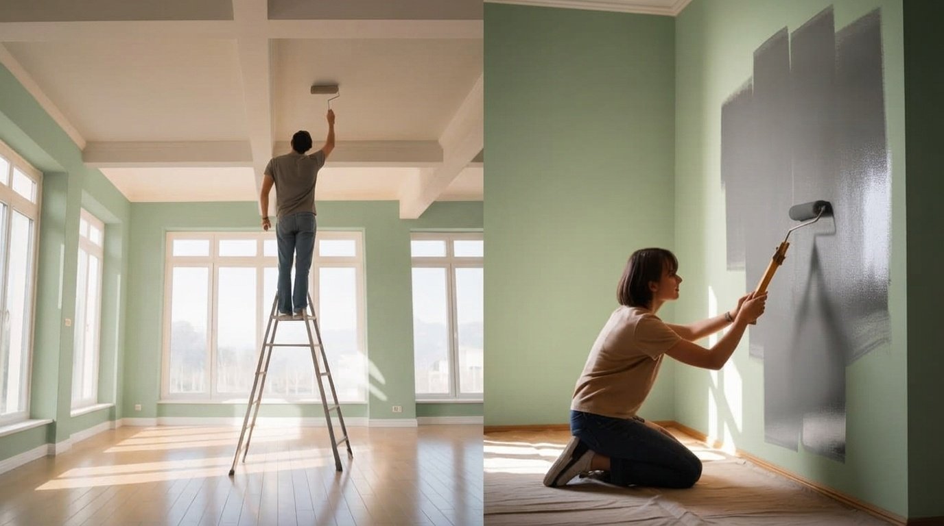
- Skipping the sample test. Always test a small patch first and watch how it looks in both morning and afternoon light.
- Chasing trends. A trendy color that does not suit your home will look dated in two years.
Conclusion
I made plenty of color mistakes before landing on what actually works. This guide covers the top selling sunroom paint colors so you can skip the trial and error.
Start with a sample, test it in your real light, and go with what feels right for your space.
Found your perfect shade? Drop it in the comments below. I read every one. And if this helped, share it with someone redoing their sunroom too.
Frequently Asked Questions
What is the most popular sunroom paint color?
Crisp white and warm white are consistently the top picks because they work well with natural light.
Should I use the same paint inside and outside the sunroom?
No, exterior and interior paints are made for different conditions and should not be used interchangeably.
How many paint samples should I test before deciding?
Test at least three to four shades directly on your wall and check them in different lighting throughout the day.
Is a dark color ever a good choice for a sunroom?
A single dark accent wall can add warmth, but covering all four walls in a deep shade tends to make the space feel smaller.
How often does sunroom paint need to be touched up?
In high-light sunrooms, plan to repaint or touch up every three to five years depending on the finish and sun exposure.